The on-site analytics widget is the best way to access heatmap reports. This guide will show you all of the things you can do from the widget.
The widget is the best way to access heatmaps because you don't have to visit Clicky at all. Instead, when you are on your own website, you should see this widget right in the corner. If you don't see the widget when you're on your website, please see
this article for troubleshooting.
When you click the heatmap icon in the widget, you will see this menu. By default you will immediately see a heatmap for the page you are viewing for "today". Use this menu to change the date range if you wish to see more data, which is particularly important for lower traffic sites.
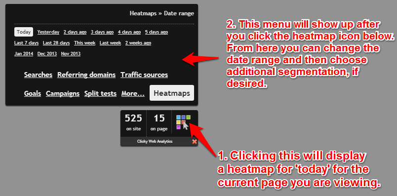
For most sites, viewing a single day is not enough to get much meaningful data from heatmaps. So you can choose something larger, such as "last 7 days", and you'll immediately see a new heatmap for the last 7 days.
It's important to note that once you select a date range, it will "stick" for as long as you have this menu open. This is useful to know when you dive into segmentation, which we'll show you here.
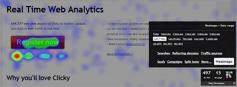
In the screenshot below, after selecting the last 7 days for our date range, we clicked the "goals" menu option so we can analyze where people are clicking on our home page for those who complete specific goals.
Note that the date range we selected is shown in the top-right corner of this menu.
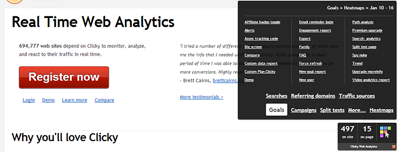
Once we clicked on goals, the heatmap in the background disappeared because we're entering segmentation mode (for goals, in this case), but haven't select a specific segment (goal) to view yet.
Note that at this point, the menu has refreshed to show us our top 30 goals for our desired date range.
Let's see where visitors completing the "new user" goal are clicking. (This goal tracks people who register a new account on our website). You can see a huge difference difference here for "new users" vs "everyone" for the last 7 days (two screenshots up the page): A much larger percentage of these people are clicking the "register" button, as well as checking out our live demo and viewing our comparison matrix, which is exactly what we want to be happening.
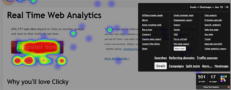
This is a simple example (obviously, all "new users" are going to click the register button) but it also shows us that having the demo and compare links right there are getting lots of action too. The main point is to show what you can do with segmented heatmaps. No other service offers this kind of functionality, so we encourage you to play with it!
 0 online
0 visitors
0 actions
0 online
0 visitors
0 actions