Long term metrics, and other goodies
Our newest update is all about the long term, and it's one of the best things we've ever done. I'd recommend grabbing a fresh pair of pants before reading on because you're going to need them before you're done reading this.
It all started out innocently enough: A fairly simple update to goals that before I knew it had morphed into something else entirely. 80% of the stuff in this update was never planned, all of these ideas just starting coming to me as I kept working on it. "Hmmm this would be sweet, oh this too, oh and this…" Within days my bullet point todo list for this update was ridiculously long and ended up taking almost 3 weeks to complete. But that's the way it usually goes when I feel I'm on to something good.
New goal report
The main goal report still looks the same — until you click on a goal, that is. This new "single goal" report is awesome. Here's an example of one goal we track for new users registering with Clicky:
Talking points:
- You can now graph all goal metrics (conversions, conversion rate, revenue [not shown], visits to goal, and time to goal), simply by clicking on any of those large-sized metrics at the top of the report. Previously you could only graph conversions. We've had a million requests to graph this other data — now you finally can. We considered graphing all of them at once but they all have vastly different scales and it simply did not work well.
- "This visit" and "first visit" — Like most non-enterprise level services, Clicky used to only give you "this visit" data, e.g. data from the current session where the visitor converted. While interesting, most visitors do not convert on their first visit to your web site, so this data doesn't show the long term effects of your marketing efforts — example, which campaign they originally came in from when they bought something two weeks later, or what site they originally were referred by, if any. And that's exactly what "first visit" is all about. When a visitor converts, we now look up both their current session and their very first session on your site (that we know about it) immediately and summarize it in a table that lets us generate this report really fast, even over large date ranges. I can pull up this new report for a 30 day date range for any of the goals we track in less than 1 second. Not bad! Going down these two new columns are five categories (only two are shown here to keep the size reasonable). These categories are campaigns, referring domains, searches, split tests, and goals, which we feel are the most relevant metrics to track in relation to tracking conversions. Previously you could see this data if you filtered your visitors by a goal then chose the appropriate segment, but we wanted to bring these important metrics front and center and make it load super fast. Trends are also shown for all data types in this/first visit columns, and you can of course click the red/green percentage next to any of them to graph historical data just like you can with any other report. Of note however is that we've only been tracking this data for 3 days, so there isn't much history yet.
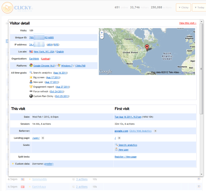
New visitor details page
The old visitor details page did the job, but I used to refer to it as "Old Betty" if that tells you anything about my feelings towards it. I wanted to make it look nice, and add way more details to it. So… I did!
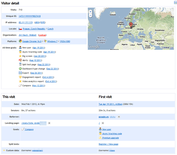
- Jam packed with details — Click here to see what this report used to look like, for the same visitor. There used to be a lot of wasted white space, with things like one line for browser, one for OS, and one for screen resolution. These are all related, so why not group together? Same with hostname/org, IP + ARIN/RIPE lookups, etc.
- All time goals — Everytime a unique visitor completes a goal for the very first time, we've logged it to a table for over a year now I think. This was originally so we could calculate the "time to goal" and "visits to goal" metrics, making sure we were only counting each person once per goal. While making this new update, I realized how interesting this data could be. I can't believe we've had it for as long as we have and never shown it to you like this. So, that's what this is. Every unique goal that this unique and beautiful snowflake has ever completed is shown here, in chronological order, with the date shown next to each one. Clicking on that date will take you to the session where they completed this goal!
- This visit / first visit — Just like the new goal report, we also show this kind of information in the visitor details page now. So now whenever you're viewing the details for any of your visitors, you can immediately see interesting details from their first visit as well — including how long ago it was (in this example, 288 days and 15 hours ago). Want to see that first visit? Click on the date. Bam.
Oh, you thought we were done?
New visitors report
- Reorganization — If you use goals or campaigns, icons for those were shown near the left for visitors who had either one attached to them. The problem with this is that most visitors don't have goals or campaigns attached, so this added a lot of empty white space in the middle of the report which always bothered me. So, we moved these icons to the very right hand side of the report. (This example is a bit cluttered because I filtered by visitors who had completed any goal, just to make sure there was lots of things to see).
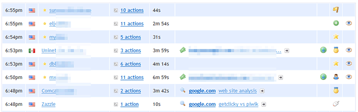
- Direct Spy access — In the screenshot above, you'll see a third icon as well next to some visitors. What is this? Oh, it's only the best thing ever! If you're old school, you'll recognize this used to be the icon we had for the Spy report, before we removed the icons because we ran out of space. If you see this eye, that means that the visitor is online now, and you can click the icon to go straight to Spy with this visitor already pre-filtered! (If you don't have a premium account, you don't have Spy, so instead we just show a green dot icon indicating their online status). (My only problem here is that the eye icon is available as a choice to you when setting up goals and campaigns. So you might want to change that if you're using it for anything, to prevent confusion. But there is no better icon to represent what this new function does, so I had to use it. Had to.)
- Quick access to visitor details — So those visitor details I was just telling you about before? Well, there's no need to actually go to the visitor details page anymore, because they're now available directly on the main visitors report. Next to the "actions" link (e.g. "3 actions"), is a grey arrow pointing top right. Click this icon and you'll immediately see the full visitor/session details page in a lightbox without having to go to a new page.
Bonus
The code that generates graphs when you click on a trend (those red/green percentages) was a mess and had been rewritten multiple times in several places for specific functionality. This is called horrible design. I took the time to rewrite it from scratch and it's way smarter and centralized in one place now, as it should be. Previously this code was unable to graph anything that had a parent/child relationship — for example, the this/first visit columns in the new goal report, that data is stored as "children" of the "parent" goal. I wouldn't have been able to let you graph this without rewriting this awful code. I really had no choice here.
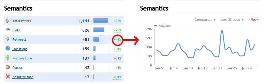
So what's the bonus? Well, if you use our Twitter keyword monitoring, of course we keep history for all of that data — but we never showed you the trend percentage because we didn't want you to try to click it and have nothing happen (this data is stored with same parent/child relationship in the database). But since that mess is fixed, I have enabled the trends on the Twitter report, including the ability to graph any of them by clicking it. I use our Twitter monitoring a bit obsessively so, considering we released this feature almost 3 years ago, it's about damn time is all I have to say.
One more thing
From a UX perspective, the fact that we graph both hourly and daily data using the same colors is confusing, because we only log some data as hourly, and we show hourly by default if we have it. The only solution I can think of is to have the two types be different colors, but I can't find anything that works with our overall color scheme. We have a heavy emphasis on blue and orange. So I tried changing one of them to orange, and it looked horrible (screenshot). I'm just wondering if anyone has any ideas in this department, because I'm at a loss.
Ok, one more
In development for 2 months now is our path analysis feature. We're still working out the wiggles but expect it to be out within a few weeks and it will make an excellent partner to goals (although of course you will be able to use it without goals).
HAPPY GROUNDHOG DAY!!!