Graphs
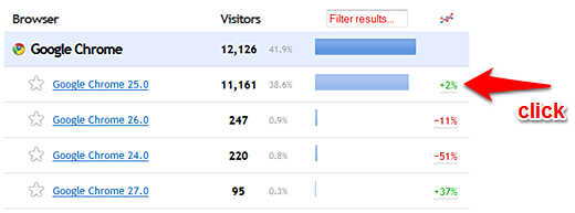
You can graph any data point from any report by clicking its
trend percentage on the right hand side.
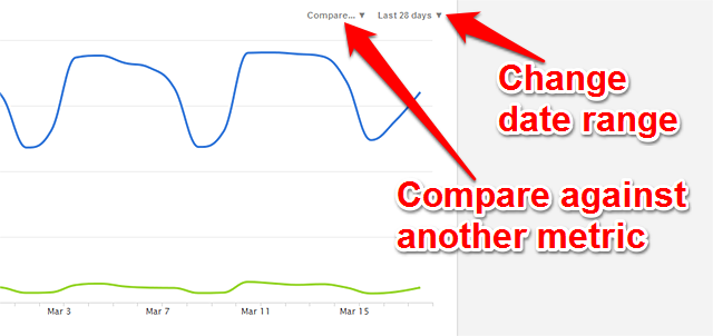
You will generally see the "last 28 days" displayed when the graph first appears, unless the data type supports hourly data as well, in which case you will see hourly data by default.
You can change the date range being graphed by using the date menu in the top right corner of the graph.
Click the trend percentage on the far right for any item to see a graph of data for that item.
Customize the date range or comparison metrics with the menus in the top right corner.
📢 Unlock the full potential of your website
Create your Clicky account and start tracking smarter
 0 online
0 visitors
0 actions
0 online
0 visitors
0 actions