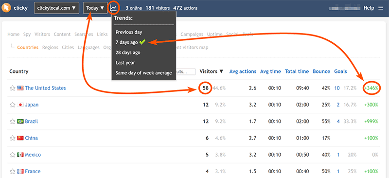
Trends compare the current date/range you are viewing vs another date/range in the past. You'll see them on the right hand side of most reports for each item in the report. Red means "worse", green means "better", and grey means no difference or no data available. You can
click on a trend to view a graph of historical data for that item.
The trend menu is available at the top of all reports, and can be used to quickly change your preference on-the-fly. You can also set this in your
user preferences. Your preference will be saved to the database with either method.

The options for trends are as follows:
- Previous day - e.g. Today vs Yesterday. (Only works with single day ranges, falls back to default trend otherwise).
- 7 days ago - e.g. this Tuesday vs last Tuesday (DEFAULT).
- 28 days ago - e.g. this Tuesday vs Tuesday from 4 weeks ago.
- Last year - Same day of week from previous year (52 weeks ago), e.g. Tue Aug 10 2021 vs Tue Aug 11 2020.
- Same day of week average - Based on the previous 4 weeks, e.g. this Tuesday vs the average of the last 4 Tuesdays. (Only works with single day ranges, falls back to default trend otherwise).
Trend options are always relative to the date/range currently being viewed, and for the same number of days.
Most websites have consistent patterns of traffic on each unique day of the week, so most trend options are in increments of 7 days (the other trends only work when viewing single days). This helps ensure you're always comparing apples to apples.
(This logic also applies to graphs when you choose "Previous period" in the "Compare..." menu).
If you are viewing a
single day, such as June 21, 2021, then "7 days ago" means June 14, 2021.
If you are viewing a
date range, such as June 21-25, 2021, then "7 days ago" still means June 14, but the total date range being viewed is 5 days, so the trend will be 5 days as well from that starting point: June 14-18.
If a date range is longer than the trend period, the trend (call it "X" number of days) will incremented by X until it is at least as long as the range. For example if you are viewing the date range June 21-30 with the "7 days ago" trend, that 10-day range is 3 days longer than the trend, so we increment the trend by 7 until it is at least as long as the range. In this case we only need to do it once, so the trend becomes 14 days ago. The end result here is comparing June 21-30 vs June 7-16, both of which are a Monday thru a (next) Wednesday. If the trend was
not extended, we'd instead be comparing June 21-30 vs June 14-23. That's 3 days of overlap which muddles the results.
(This logic also applies to graphs when you choose "Previous period" in the "Compare..." menu).
You can hover your mouse over a trend and it will always tell you the exact range that's being compared, as well as the value. Likewise, hovering your mouse over a graph when you're comparing two date ranges will show you the date for each data point on each line.
 0 online
0 visitors
0 actions
